As the first UX hire, my goal was to transform the company’s UX culture from having no focus on user experience to making it an essential part of our decision-making process.
When I joined, the company was in the middle of an acquisition. A small fintech with a promising product was merging with a large financial corporation struggling with UX. We faced several challenges:
Losing significant deals due to an unappealing UI and a disjointed experience.
90% of support calls were from clients unable to set up the product.
30% of development effort was spent on irrelevant or overly client-specific improvements.
🚀 How could I contribute to ensure a sustainable business growth in the long term?
First Month
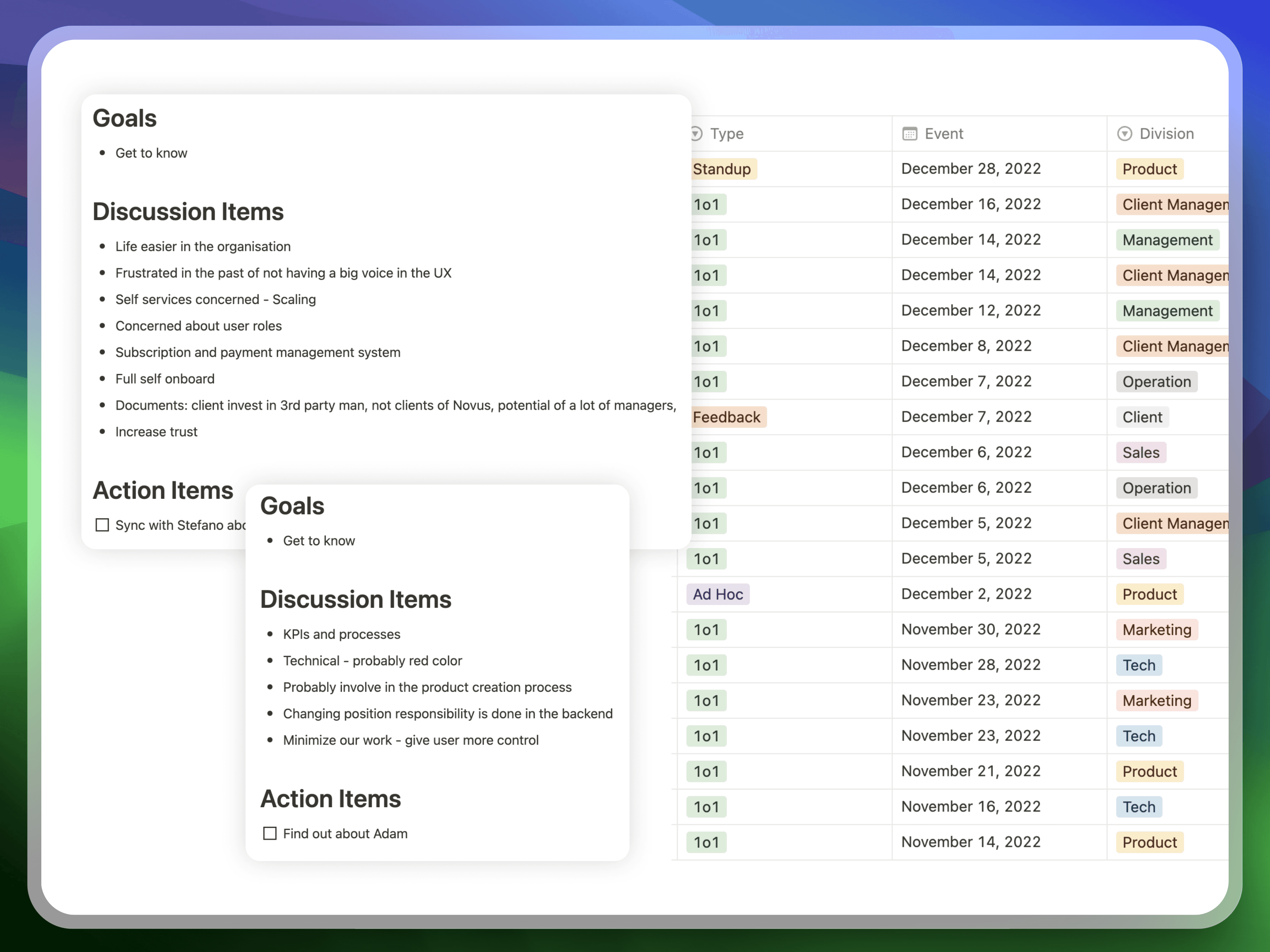
My first priority was building trust and establishing myself as a valuable resource. I conducted over 20 one-on-one meetings across departments, listening to their perspectives on the product, the users (investment professionals), and the challenges posed by the acquisition.
Key Insights:
Almost everyone recognised the need for better user experience, design standards, and user insights. This buy-in was a huge advantage
Shadowing sales pitches revealed a painful process. Sales reps were jumping through hoops with 25 browser tabs open due to the product's slowness and poor organisation.
Meeting with Marketing and Client Support highlighted a core issue: excessive product customisation was driving up costs and creating a logistical nightmare.
Agenda
Quick Wins: Demonstrating the Power of UX
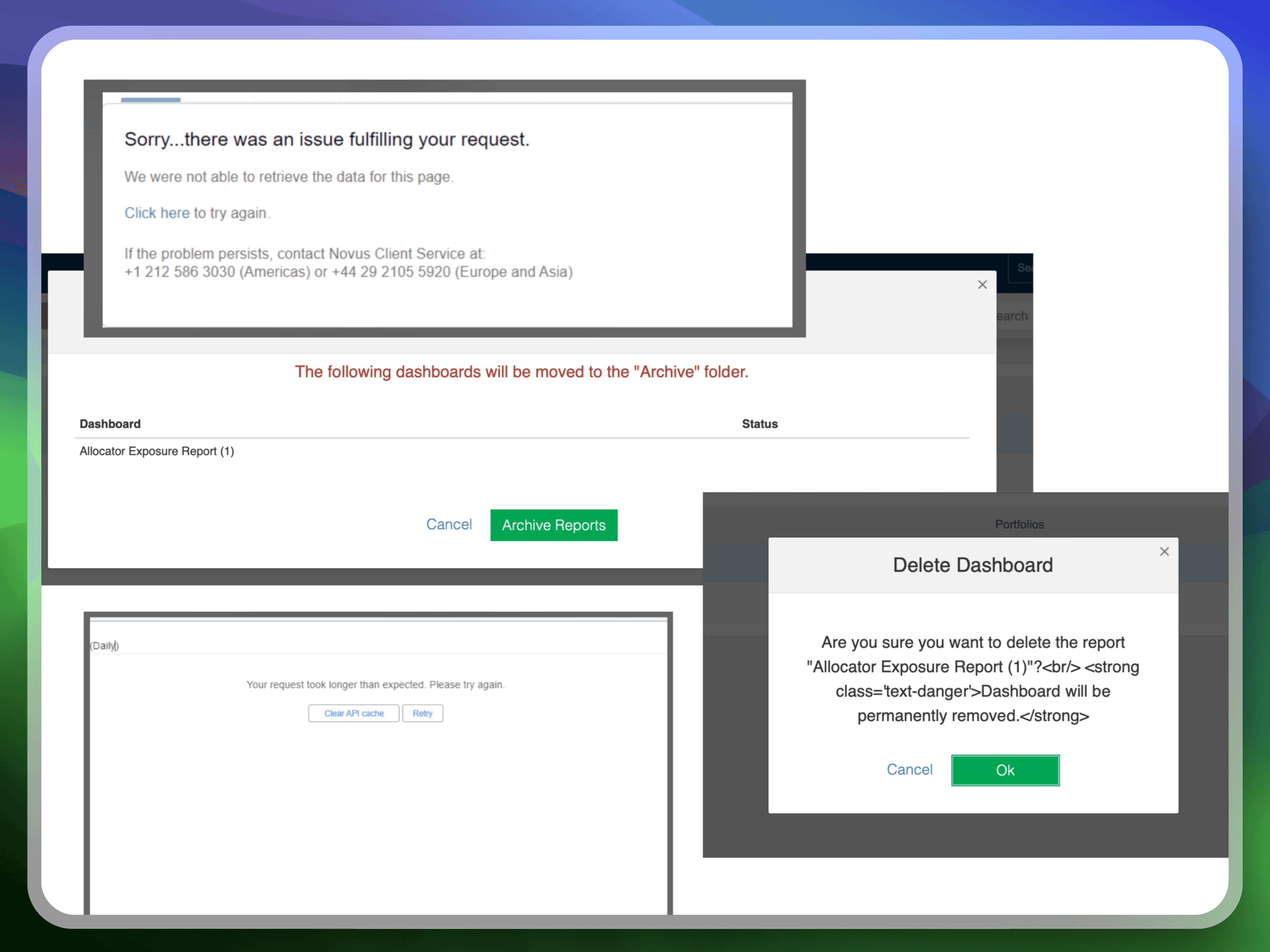
To showcase the value of UX, I started with a heuristic evaluation, focusing on quick wins like improving error messages and information modals. These were simple changes with a big impact on usability. This exercise also highlighted the need for a design system, which I noted for future development.
Messages and Errors
Where do we stand?
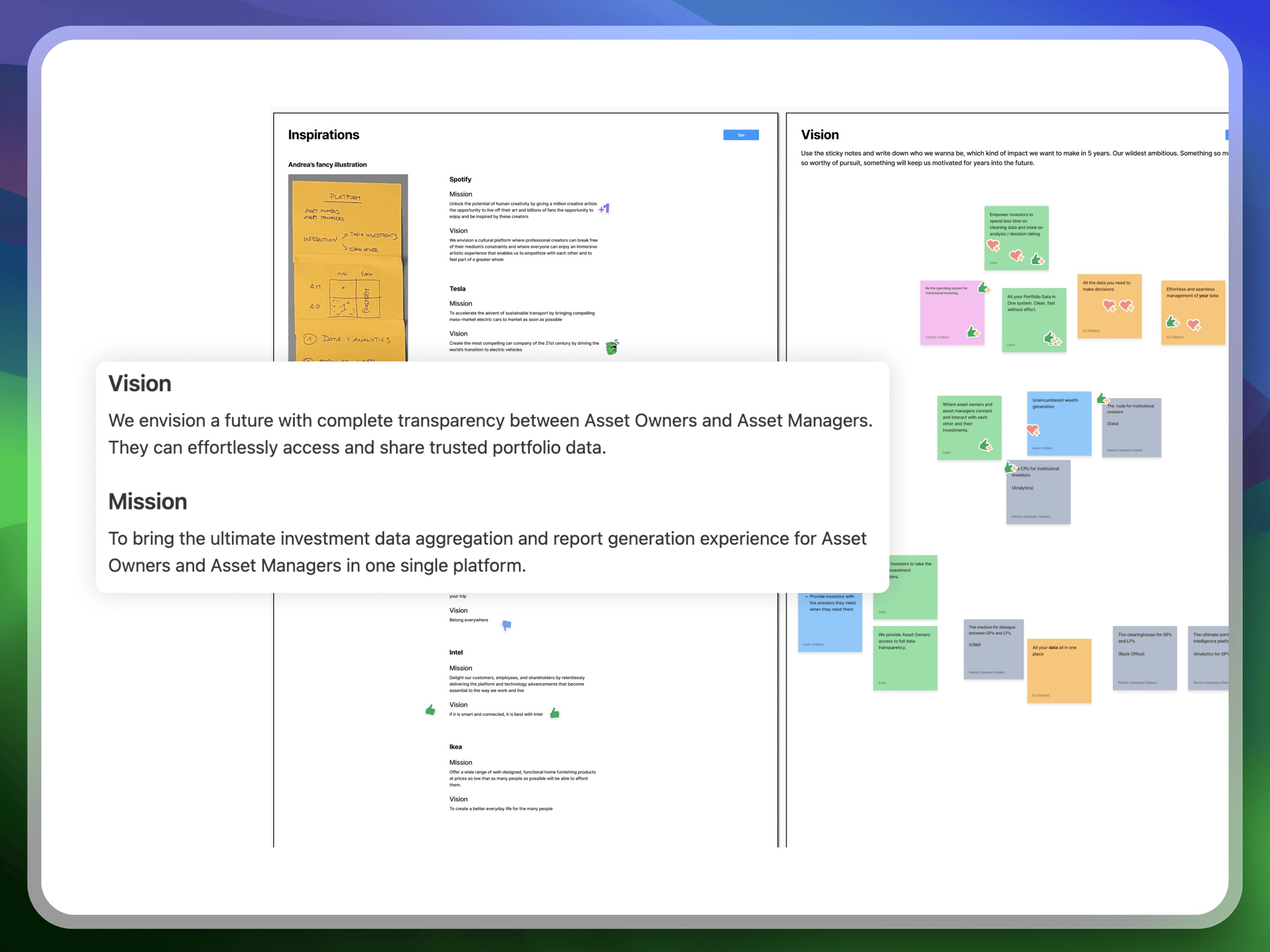
The company's vision and mission were vague, leading to misaligned priorities and inconsistent decision-making. With leadership support, we redefined these core elements, creating a shared understanding of our goals and how user-centricity would drive success.
Vision & Mission Workshop
How do we plan and deliver value to clients?
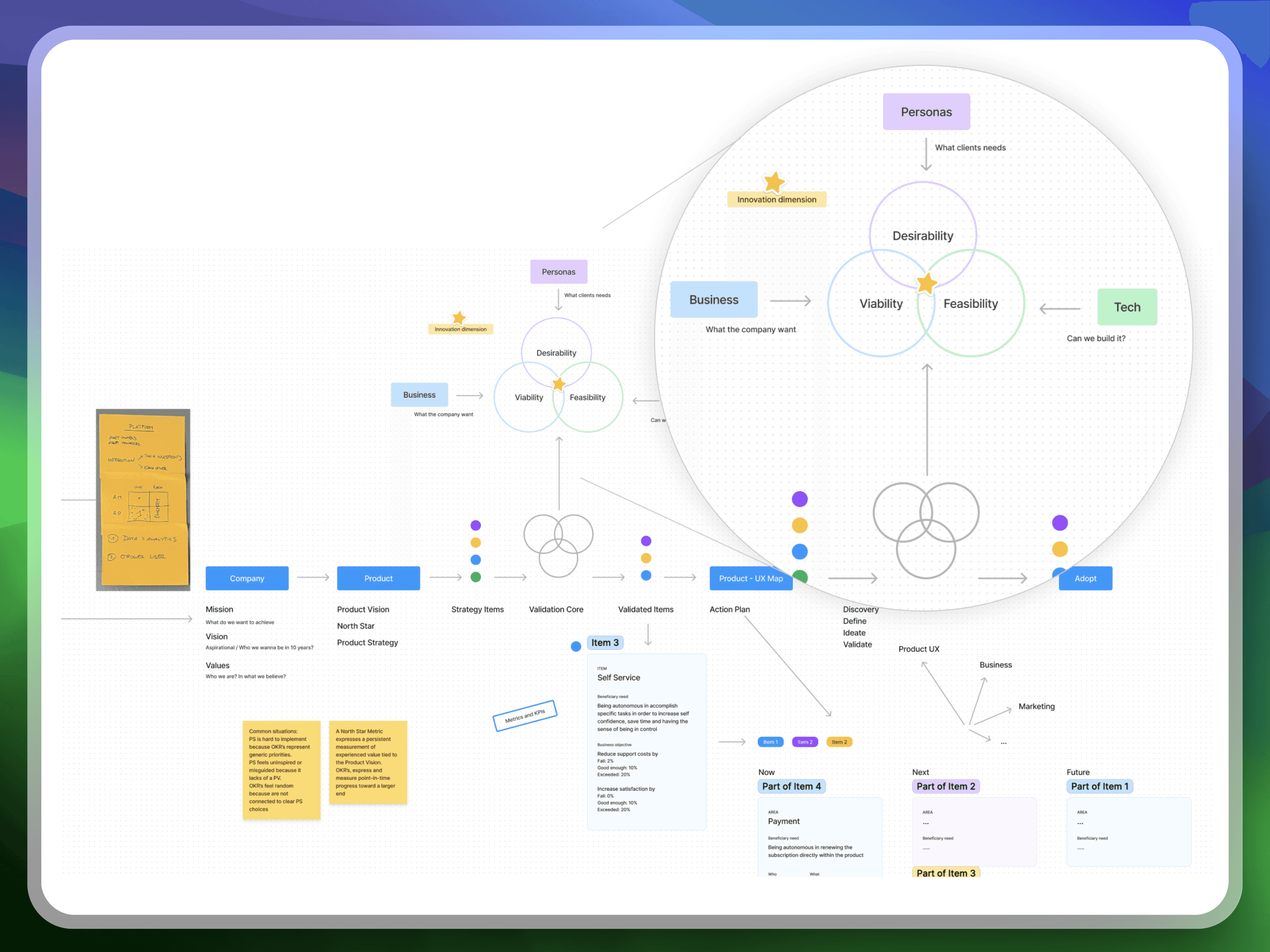
With our foundation set, we aligned our processes and established a shared, outcome-oriented workflow. I created a high-level sketch linking our vision to strategy and implementation.
Outcome-oriented Workflow
Getting Started with Design
To make user experience an integral part of our workflow, I facilitated company-wide UX sessions, covering:
Emphasising a flexible and responsive approach to design
Demonstrating how design thinking principles could benefit everyone, not just designers
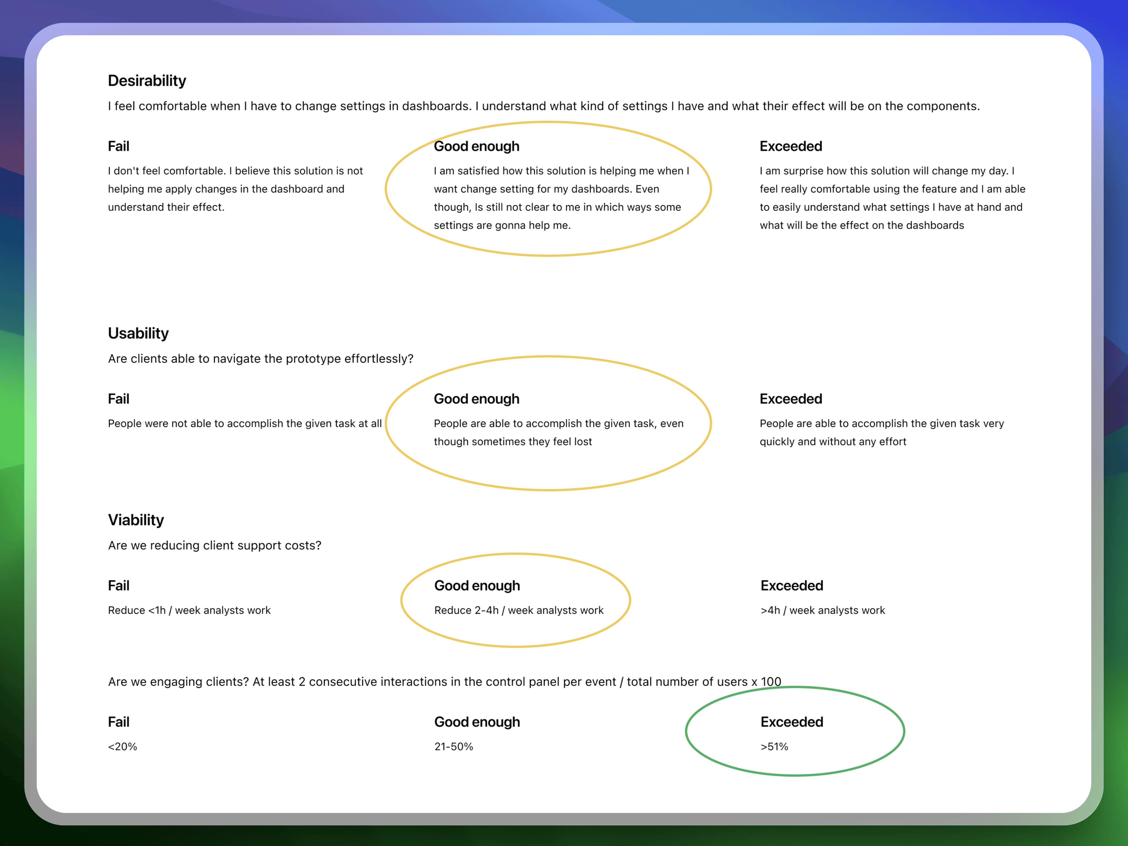
Introducing a simple scorecard to measure the impact of our design choices.
Measuring Success
I discovered that we weren’t measuring anything effectively. Our dashboard only displayed basic metrics such as active users (poorly defined), active accounts, and time spent per page.
Inspired by Spotify’s Design Team, I introduced a simple scorecard to get us started. This scorecard was used during our design process to measure the performance of prototypes during user testing and basic viability metrics post-release.
Score Card
Understanding Our Users
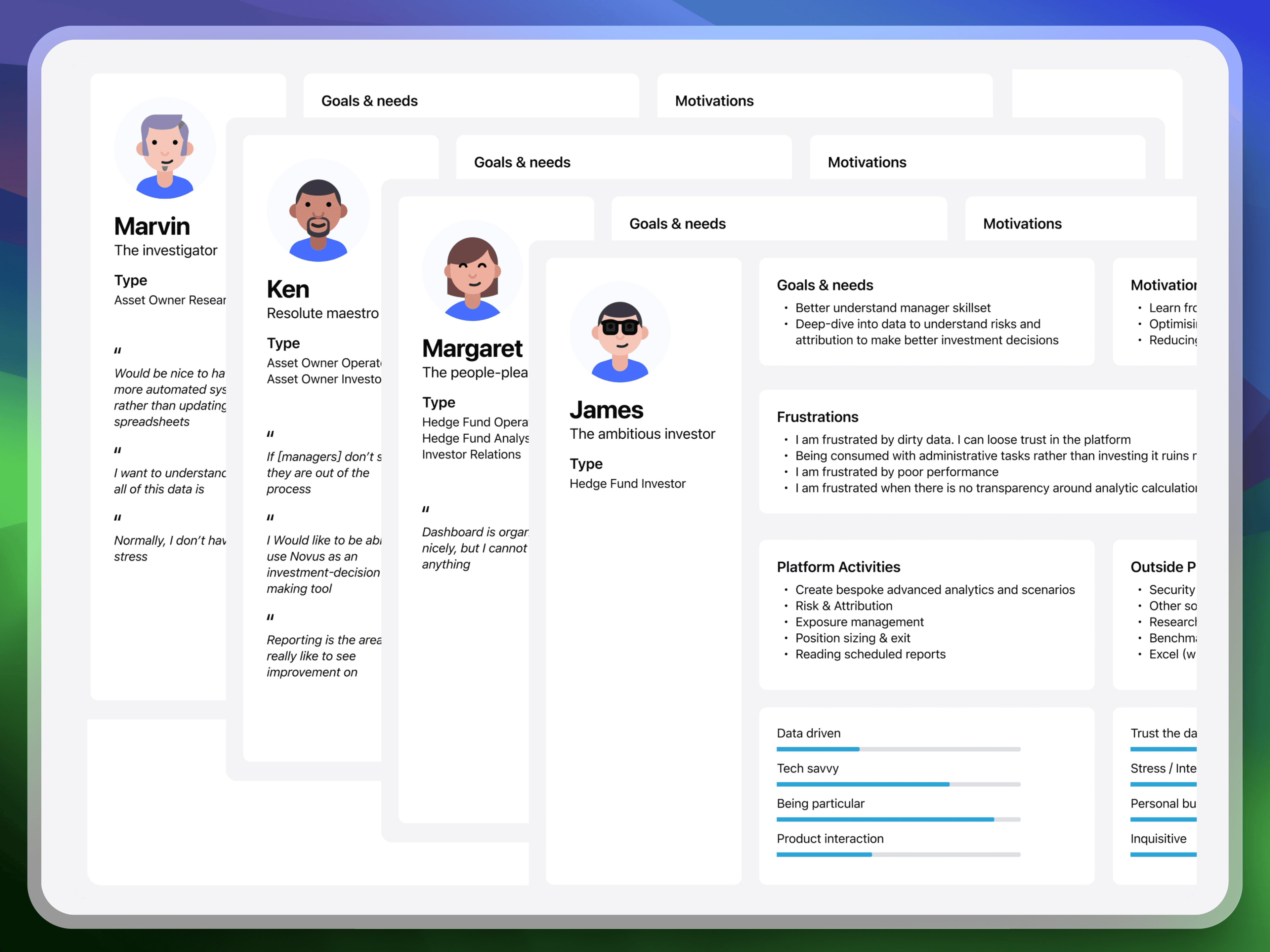
While the Marketing team had begun developing proto-personas, we needed deeper insights. I championed user research, conducting user interviews and teaching the team how to translate user feedback into actionable product improvements.
This resulted in:
We developed a clear understanding of our target audience's needs, goals, and pain points
The Marketing team gained the skills and confidence to conduct user interviews independently
User Archetypes
Assessing the Status Quo
Our roadmap was feature-driven, causing several issues:
Unclear impact on clients
Misalignment with strategy
Lack of long-term visibility
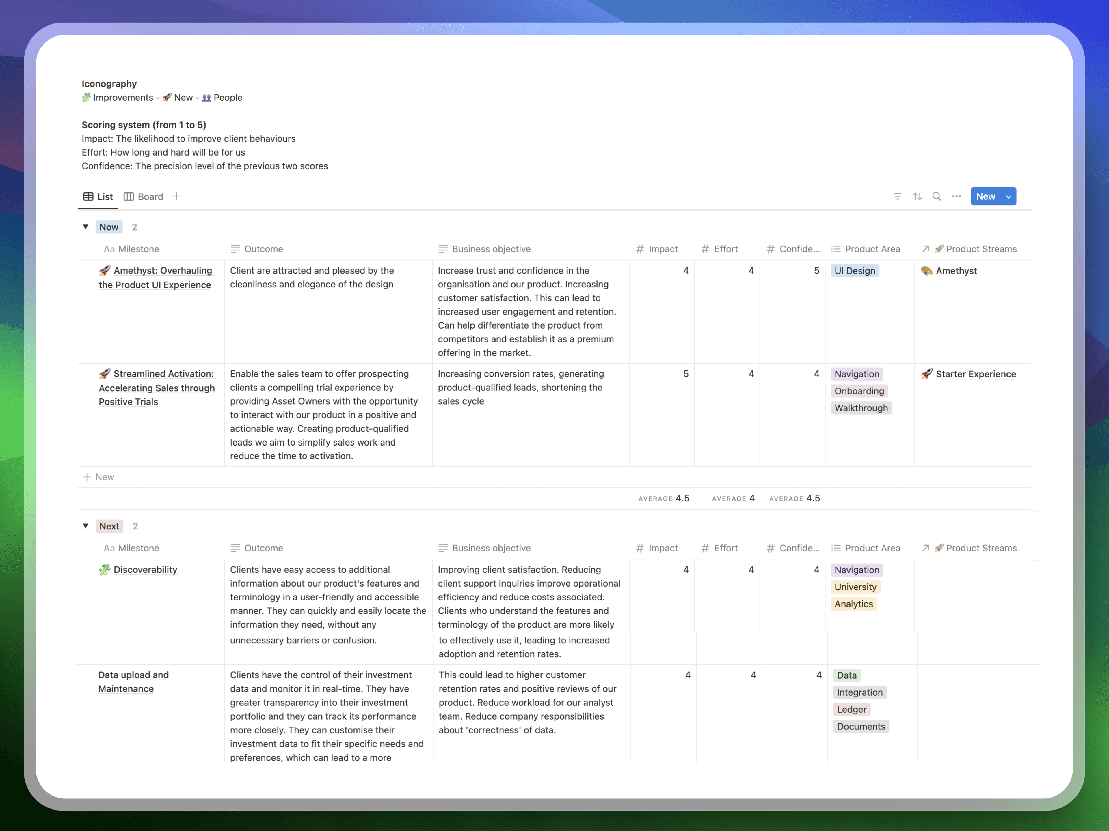
Switching to Outcome-Oriented Roadmap
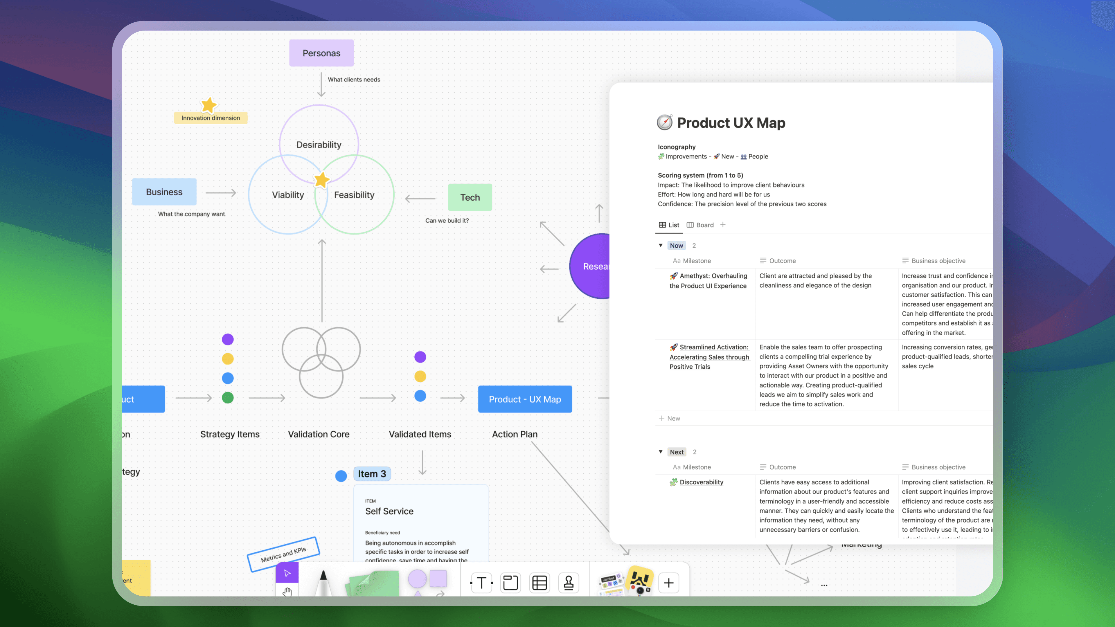
We integrated our strategy into a validation core, prioritising based on desirability and feasibility. We structured milestones around expected client outcomes and business objectives.
Product Map
The biggest challenge was translating existing items into this new approach. To make this process simpler, we discarded all the items which where not inline with the product strategy and the most relevant user needs. The remains, were correctly translated and assigned to the product manager.
I call it "music time" - immersing myself in UI design without questioning why. After five months and one major product improvement, I tackled the design system, including:
Consistent colour palette, typography, grids, and iconography.
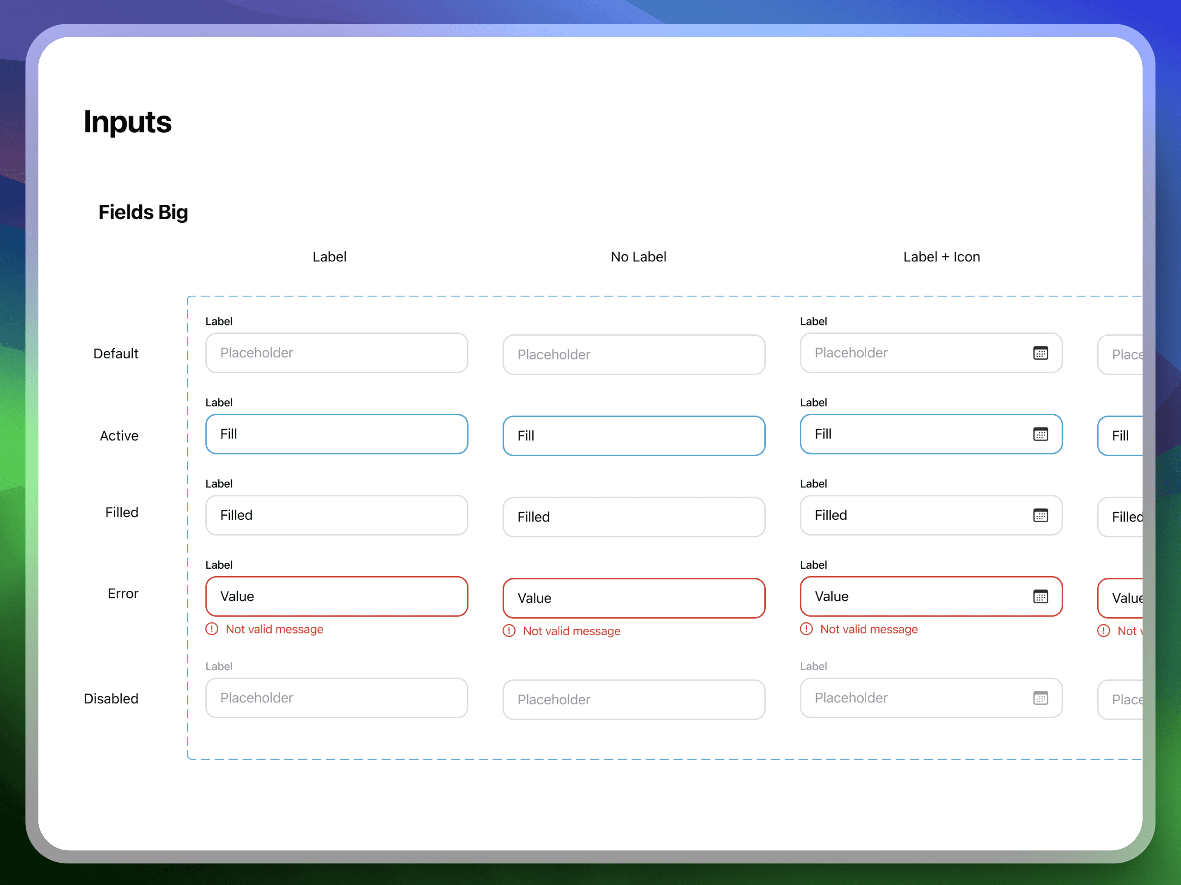
Creating a library of essential UI elements like buttons, inputs, and navigation menus.
Design System
Challenges of Implementing a New Design System and Complete UI Redesign
Ensuring minimal changes to existing UX and workflows.
Combining the redesign with a code upgrade.
Resource allocation, planning and delivery.
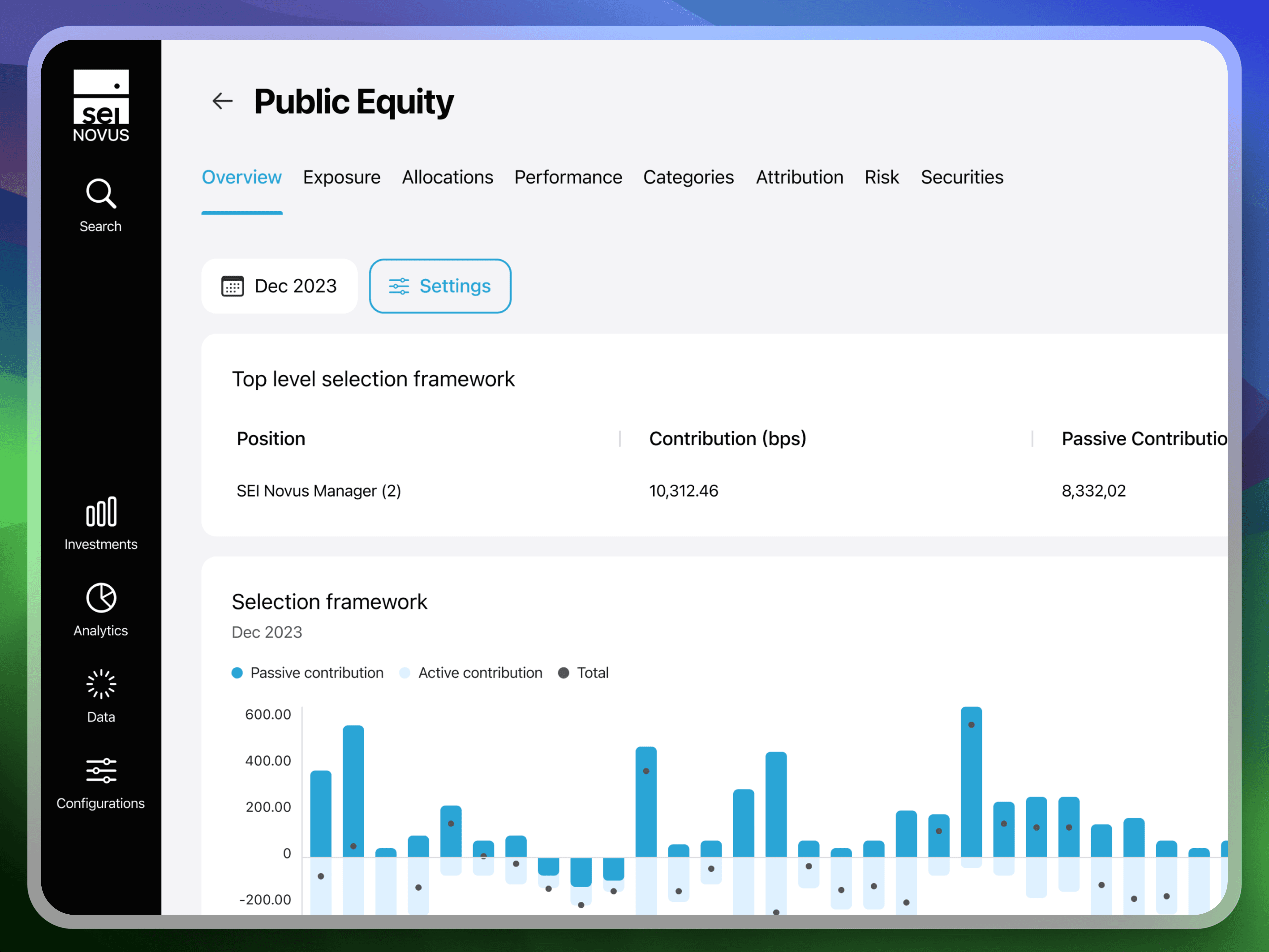
UI Revamp
Implementing the new design system alongside a code upgrade required careful planning and resource allocation. We rolled out the changes in phases, collaborating closely with the tech team and using a beta program to gather feedback and ensure a smooth transition.
Wrapping Up
Learnings
Looking back, we achieved significant goals thanks to the support of key team members. We learned the importance of senior management buy-in and the power of iterative design and user feedback.
UX is not just the responsibility of the design team, but rather a shared mindset that should permeate the entire organization.
Future Objectives
We will continue refining our UX processes to align with evolving business needs and user expectations, setting the stage for long-term, user-centered growth and innovation.
Zurich Team
