As Lead Designer at a fintech startup, I faced a critical challenge. Our analytics dashboard, designed for investment professionals, was powerful but incredibly complex. This led to several critical issues:
The dashboard was difficult to navigate, used overly technical language, and lacked intuitive workflows.
Users relied heavily on our support team for even basic tasks, driving up operational costs and hindering growth.
Despite its potential, the dashboard had a dismal 5% interaction rate, highlighting user frustration and missed opportunities.
🚀 How could we reduce operational costs through thoughtful product design while improving the user experience?
To ensure our efforts aligned with both user needs and business goals, I introduced the "Innovation Dimensions" framework:
Viability (Business Goal): Reduce operational costs related to client support.
Desirability (User Needs): Enable investment professionals to quickly understand, customise, and generate reports from the dashboard.
Feasibility (Tech Constraints): Maintain our competitive edge in customisation while working within time and budget limitations.
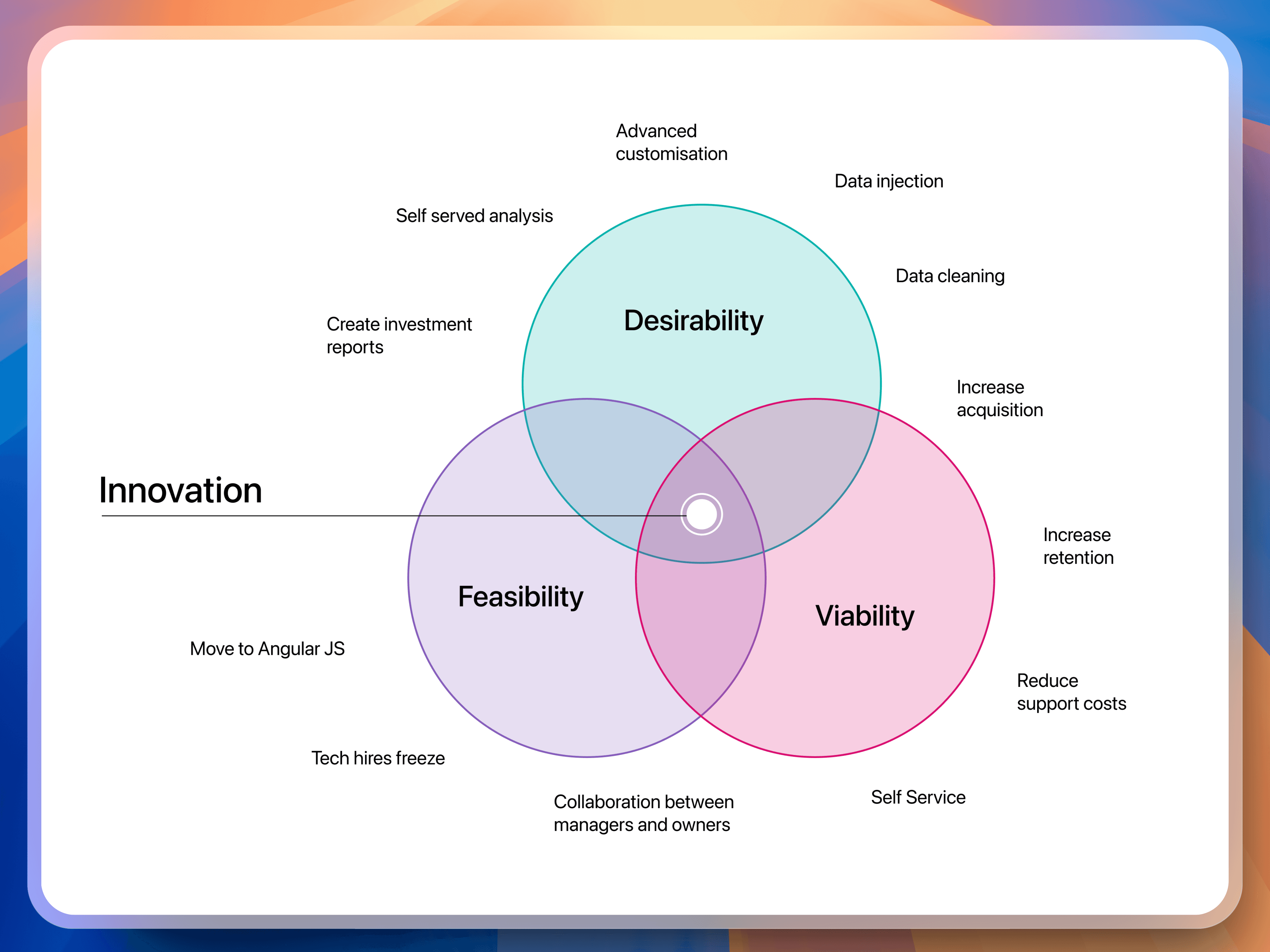
Innovation Dimensions
This framework served as our guiding star, ensuring every design decision added value for both the business and our users.
While we had some user feedback, it lacked the depth and context needed to guide design decisions. But hey, all good! We were already conducting user interviews to create user archetypes.
This collaborative approach allowed us to:
By asking the right questions and observing user behavior, we gained a deeper understanding of their pain points and needs.
Witnessing user struggles firsthand fostered a shared understanding and commitment to creating a better experience.
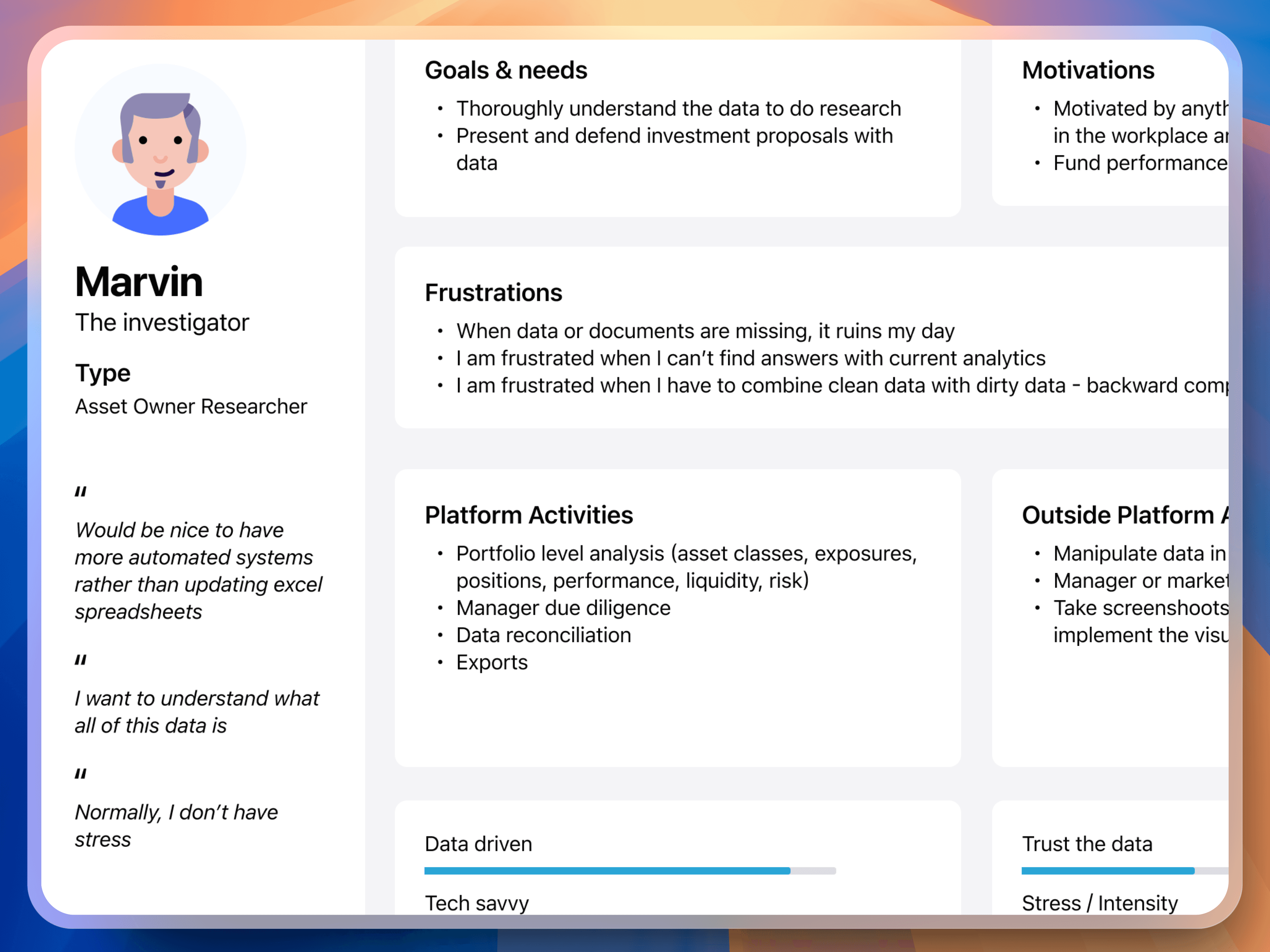
User Insights
Addressing Limitations
With our business objectives and user needs clear, we worked with the tech team to understand our limitations. We had to:
Maintain our competitive edge of high customisation
Work within time and budget limitations
Keep the scope focused on cost reduction
Armed with actionable insights, we focused on simplifying the dashboard's complexity without sacrificing its power. Key improvements included:
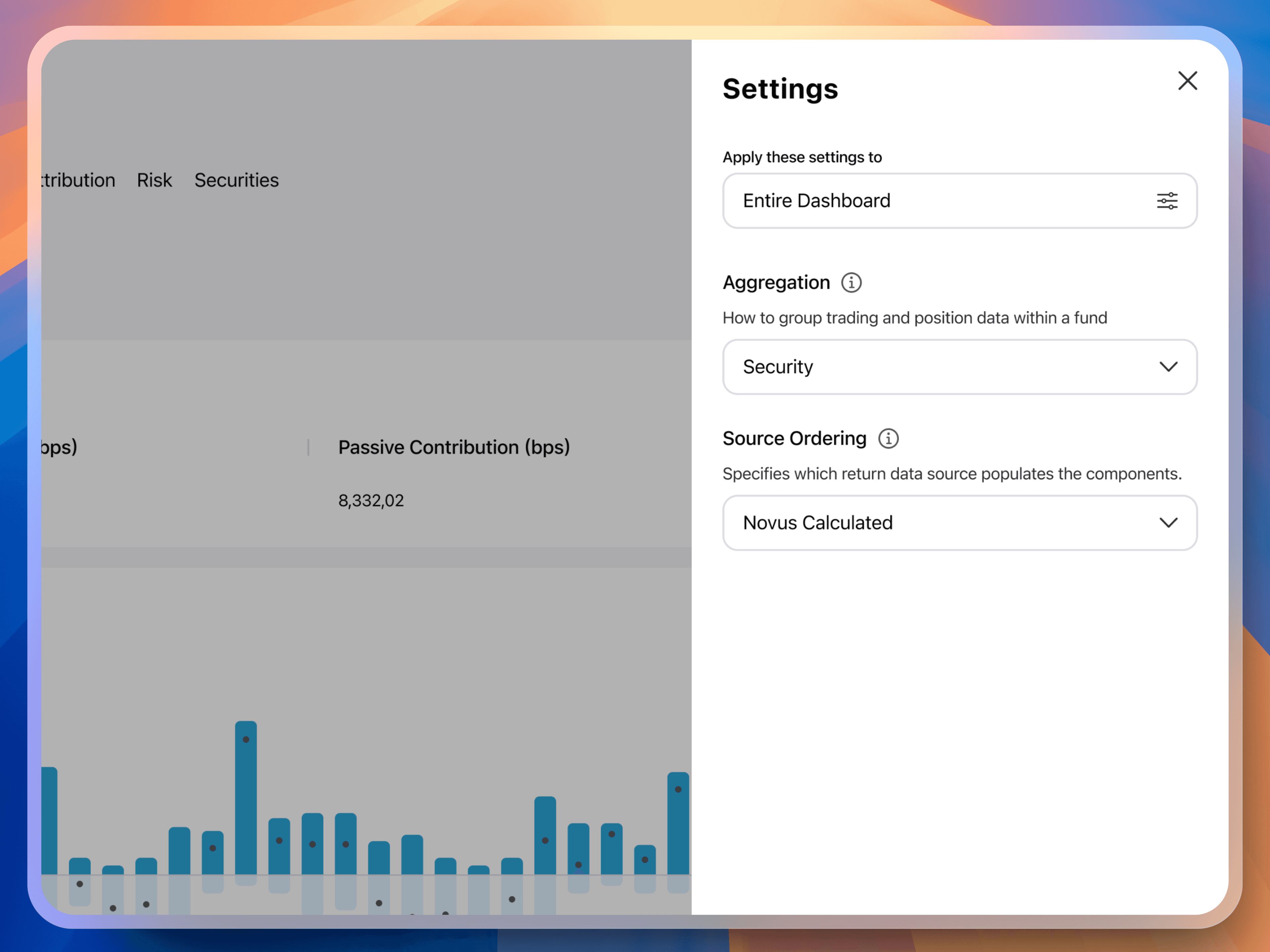
We prioritised essential settings and grouped advanced options into an accessible side panel, making the main page easier to scan and understand.
We replaced technical jargon with clear, concise language that resonated with our users.
We added contextual help and tooltips to guide users through complex tasks and reduce errors.
We run a minified version of the Google Design Sprint to explore solutions and foster design thinking across the company.
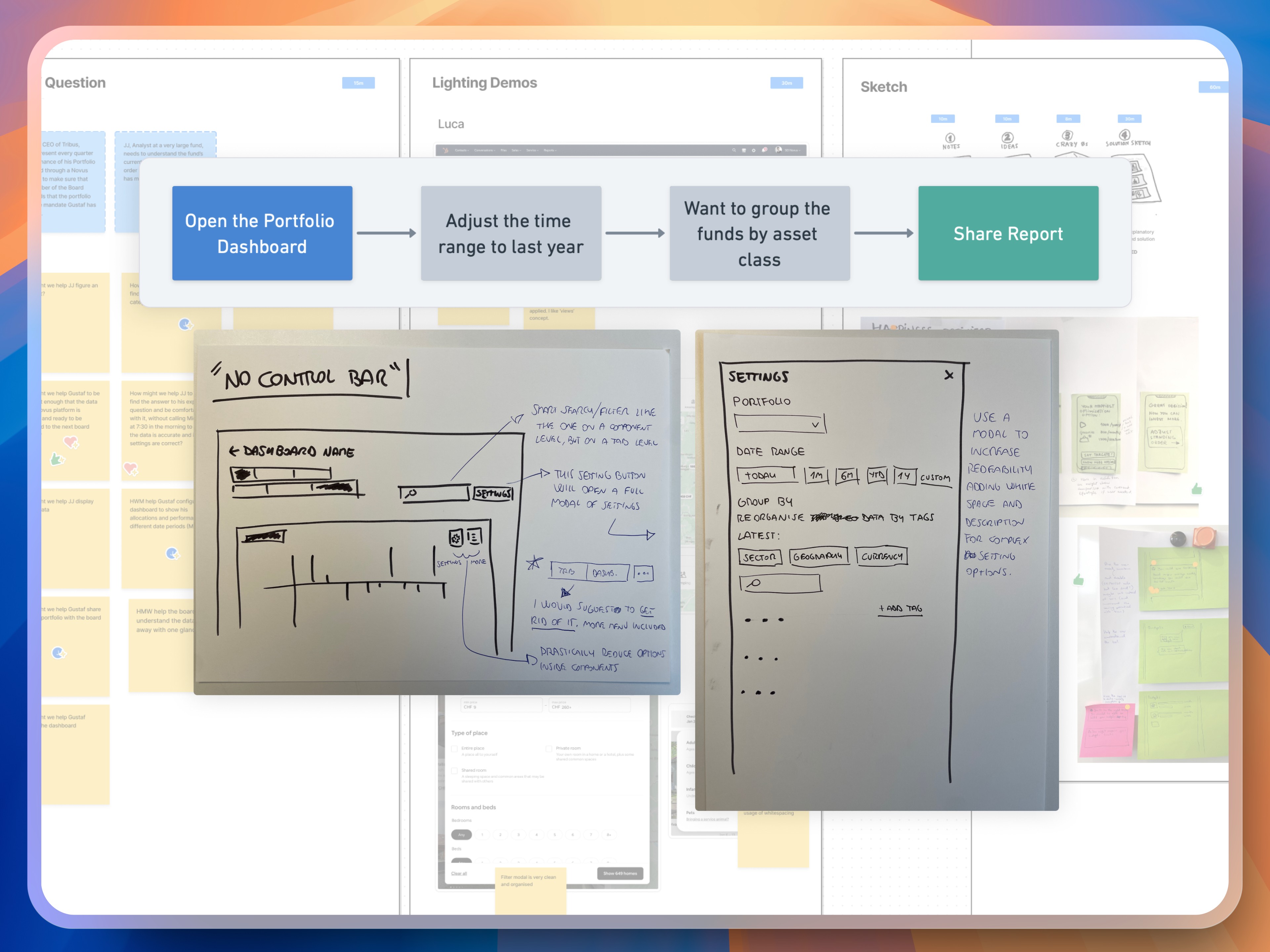
Design Sprint
Simplifying the Dashboard
By improving the information hierarchy: we prioritised essential settings and grouped advanced options in an accessible side panel, making the main page easier to scan and understand.
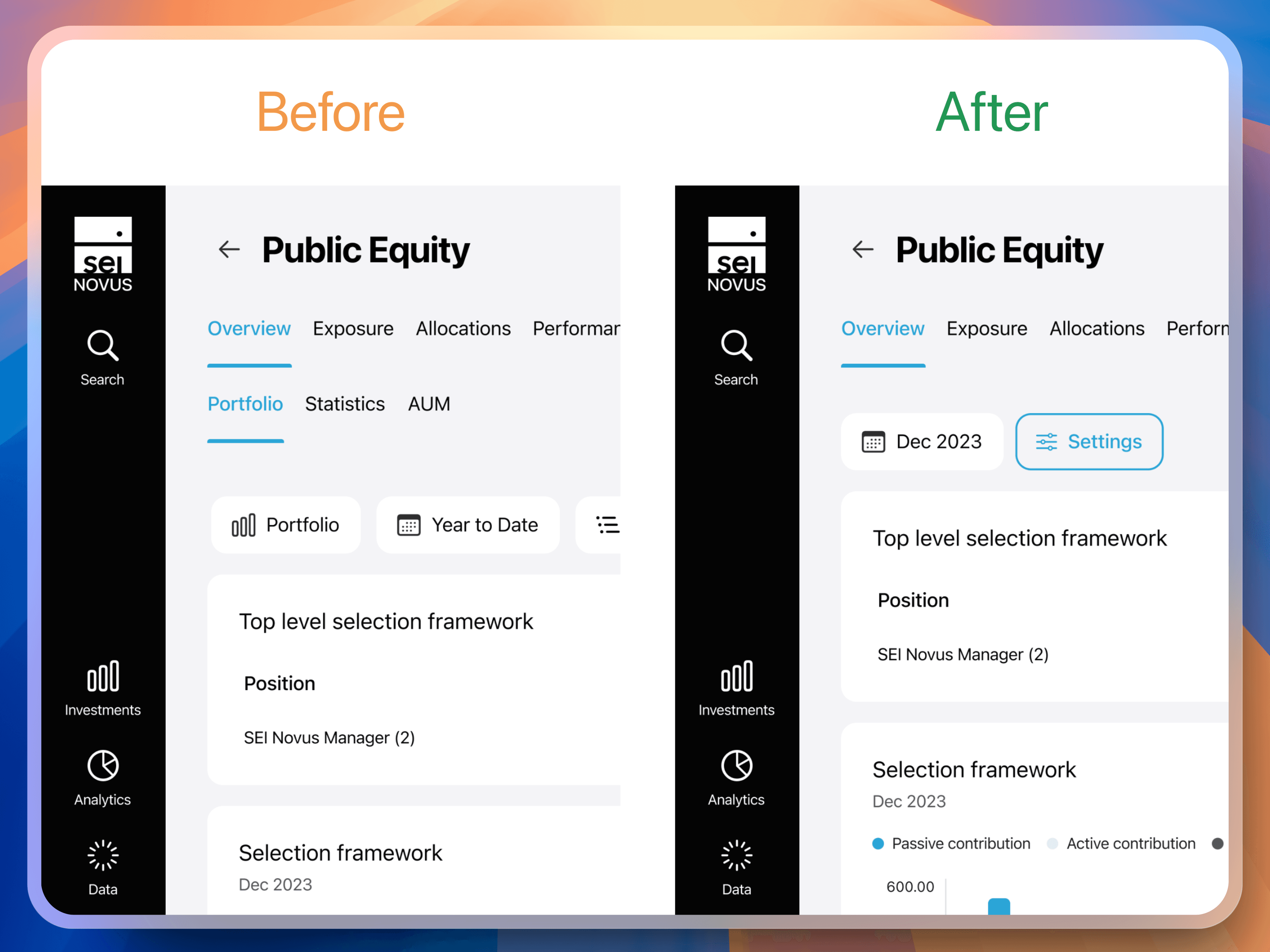
1 navigation component + essential settings + more setting button
New side bar
Providing Better Guidance
We added clear explanations to help users understand customisation options. This reduced the need for support intervention.
Side Bar with Help
🎯 We believe that users will better understand the analytic dashboard and how to use our advanced settings to create an investment report themselves, thereby reducing the need for the support team to intervene.
Despite the challenges of accessing our niche user base, we conducted valuable testing sessions. These sessions highlighted the importance of:
Repositioning action buttons where they used to be, even if cause a little design inconsistency
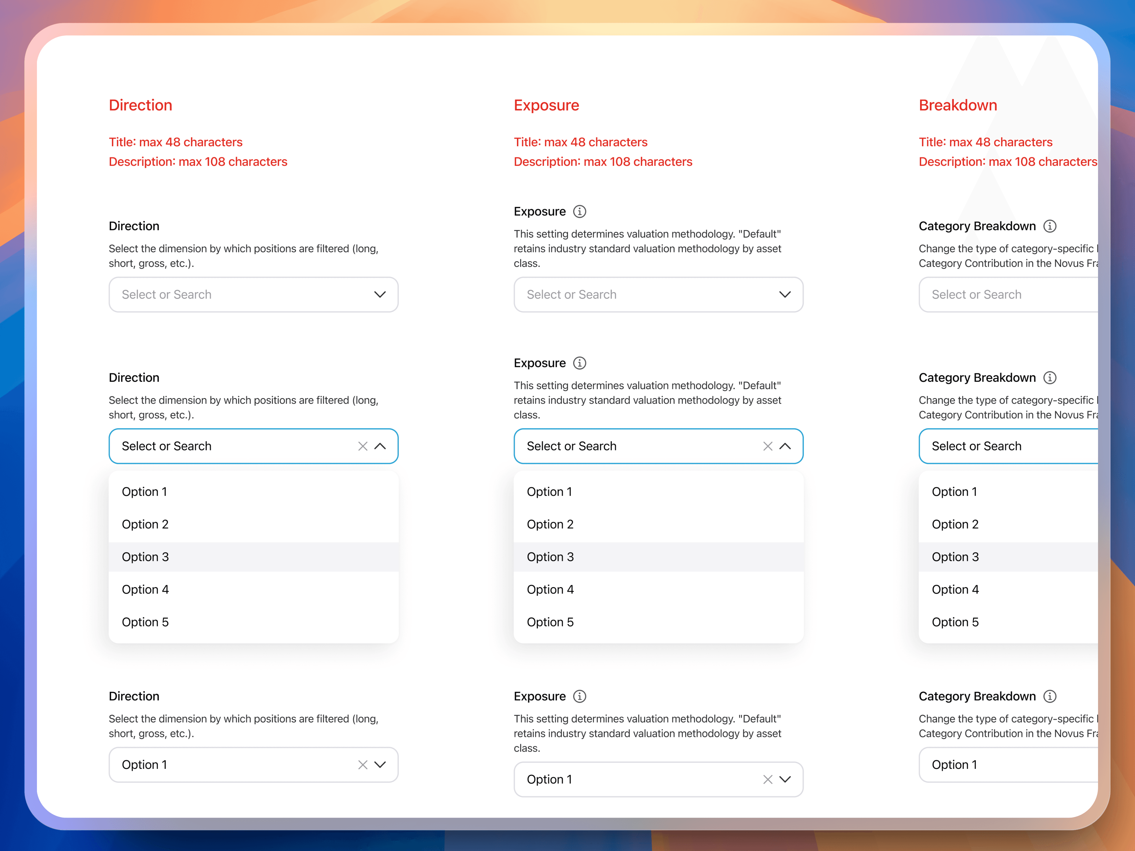
Replacing checkboxes with select component to improve readability for clients with many page tabs
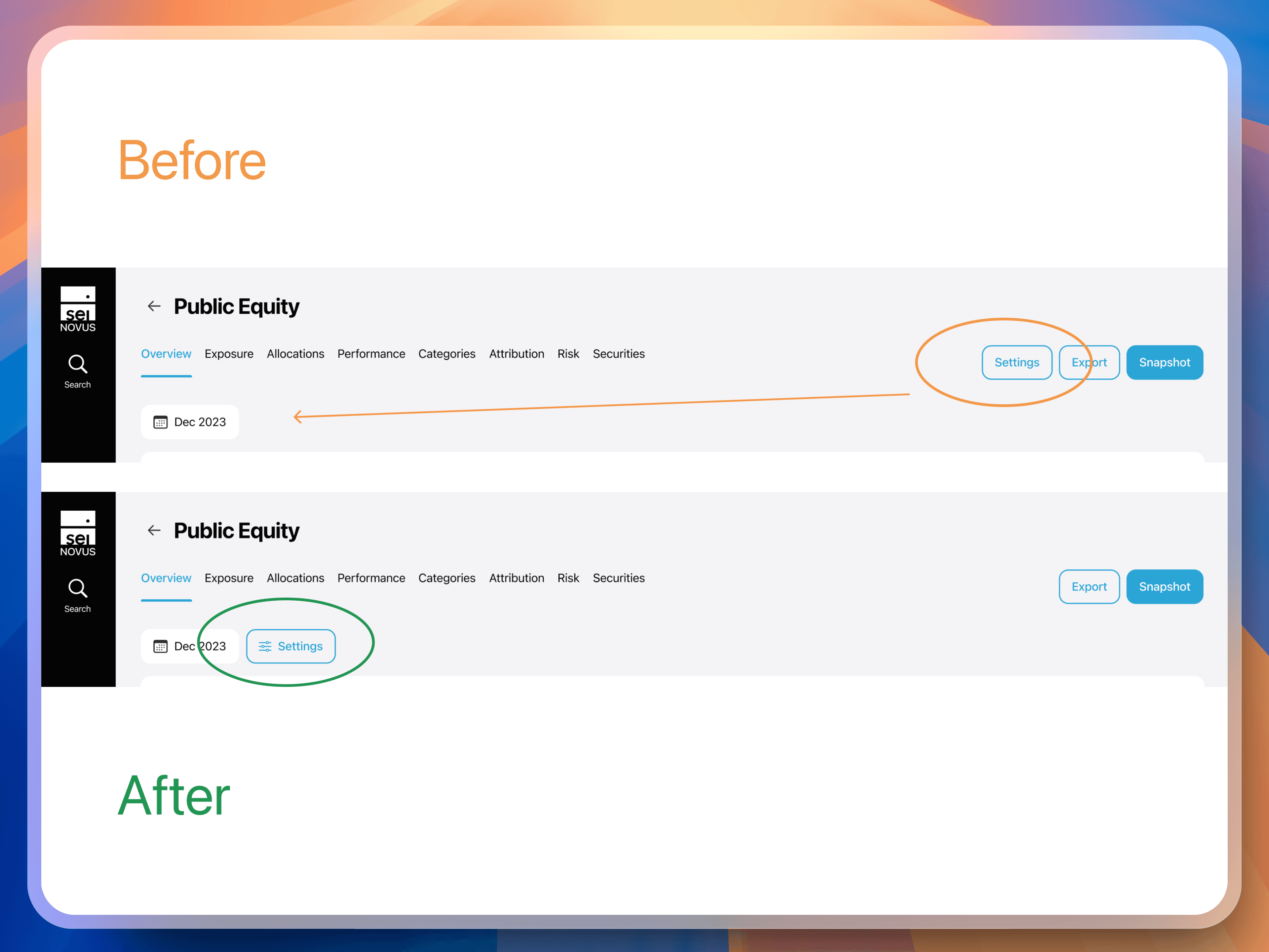
Setting button back near main settings
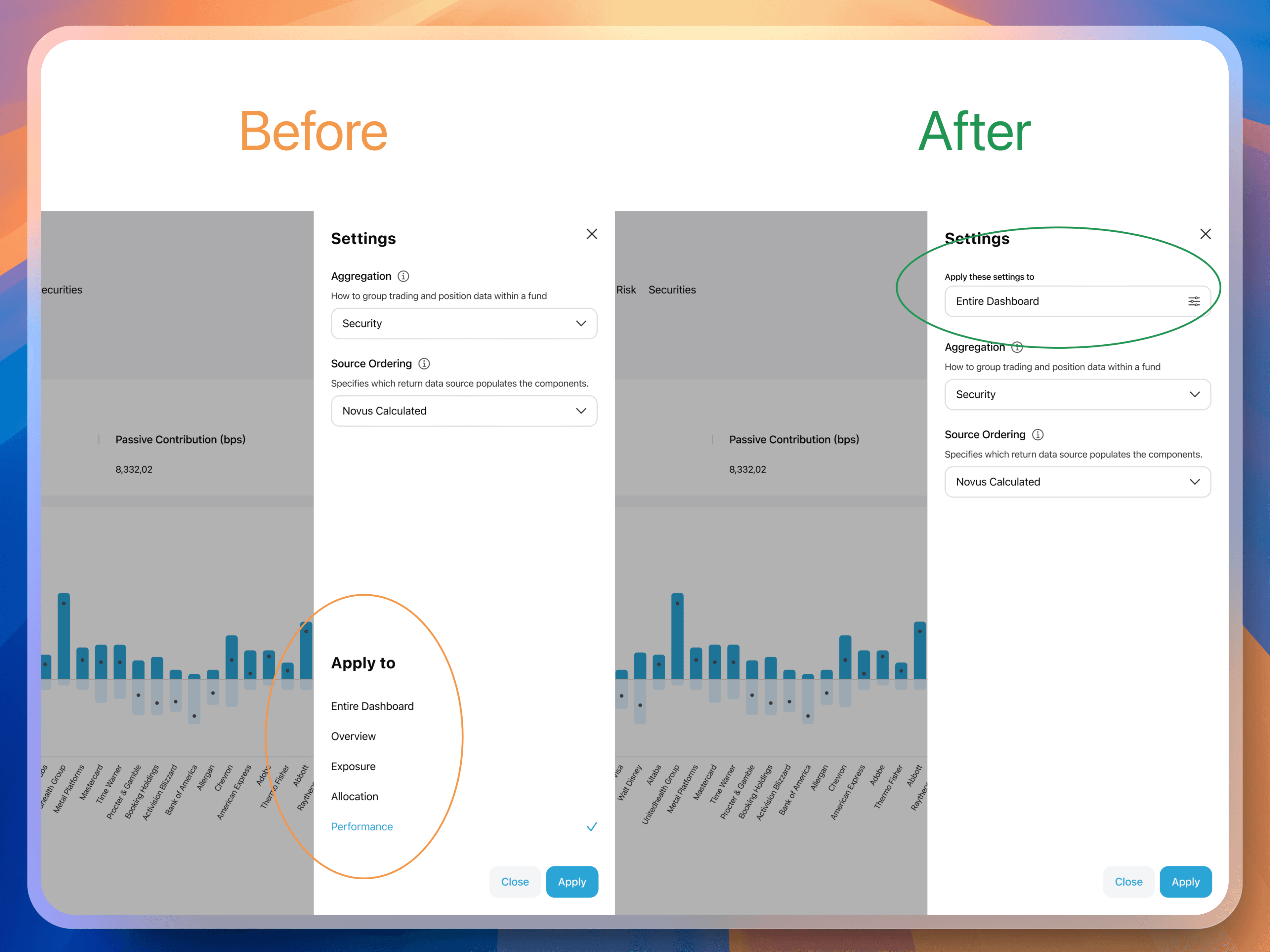
Dropdown replace checkboxes
To demonstrate the impact of our work and foster a data-driven culture, I introduced the Spotify Scorecard to measure:
Desirability: Do users find the dashboard valuable and appealing?
Usability: How easy is it for users to accomplish their tasks?
Viability: Does the solution align with business goals and technical constraints?
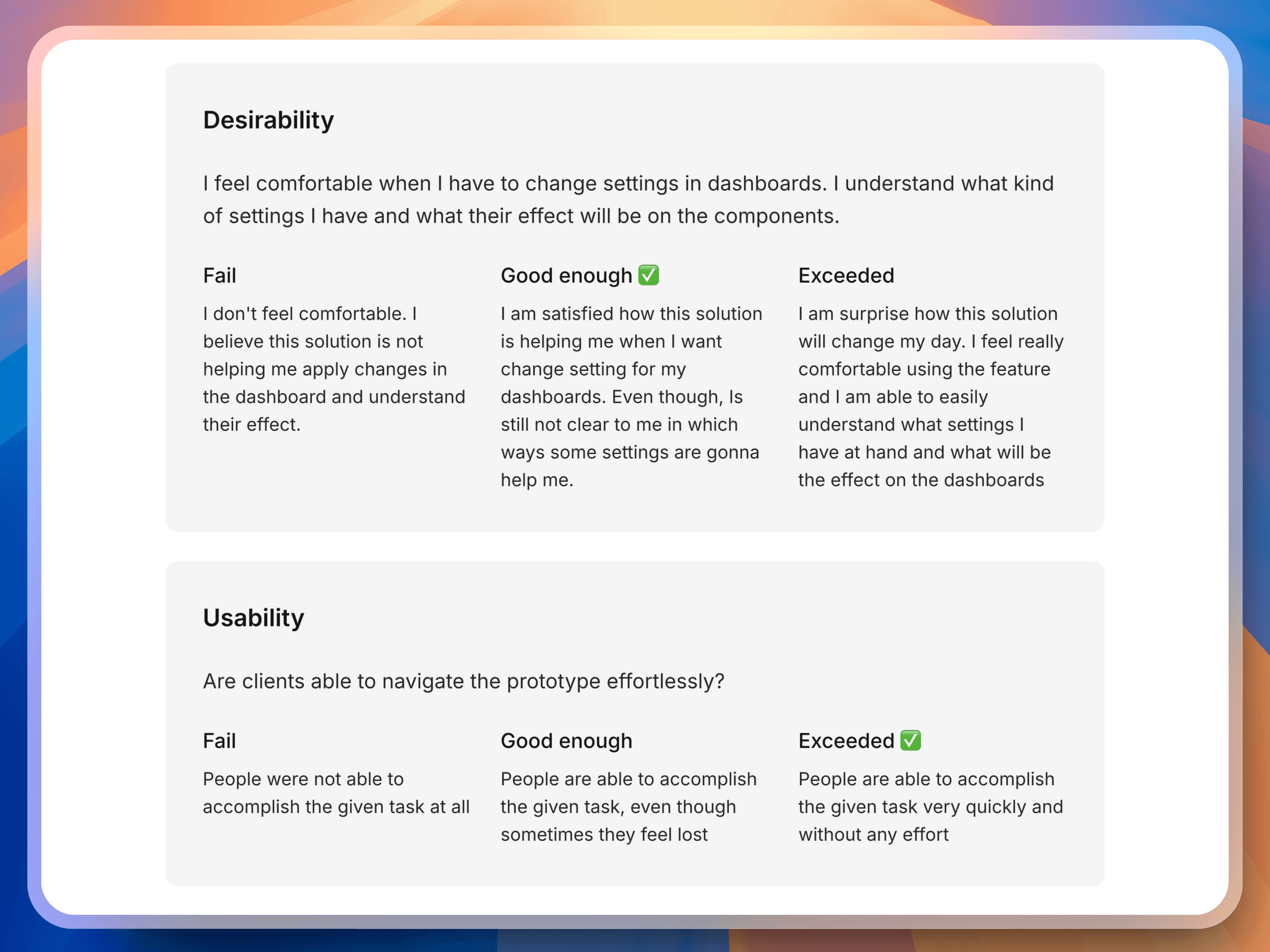
Usability Testing Score Card
Three months after launch, we achieved:
Dashboard interaction rate skyrocketed from 5% to 70%, indicating a dramatic increase in user engagement and adoption.
We reduced support workload by 4 hours per week, exceeding our initial goal and freeing up valuable resources.
Investment professionals could finally use the dashboard effectively, leading to greater satisfaction and reduced churn.